Lets Just Call This --> How to make a Cube
Tags:
TW: This is not a tutorial,think of it as beardcrumbs
One of the ways you get comfortable with your craft as a developer is to build projects.
The logic behind this is that you will learn and retain more knowledge as you build till your heart's content, get stuck, break things, fix them, etc.
It’s considered a much better way to grasp new concepts than the alternative:
🔥 🔥 "TUTORIAL HELL" 🔥 🔥
I won't go deeper into that since I know what most of you are really here for:

With that being said, I want to give you a glimpse into one of the so-called experiments I have been working on.
See the Pen Pixel Cube #1 by Montique Stevens (@nycbeardo) on CodePen.
This is just a cube but as you can see theres more to it. Digging deeper into my new obsession with CSS Art, I decided to try building various shapes and patterns while also taking the time to learn more about adding animations and transitions to them without the use of JavaScript (for now).
I had two main goals to make this work:
- Create the cube
- Get the cube to spin
To get step one accomplished I needed to structure my code in a way that when I style those elements in CSS they would overlap to form the desired shape.
This can be done with a series of divs like so:
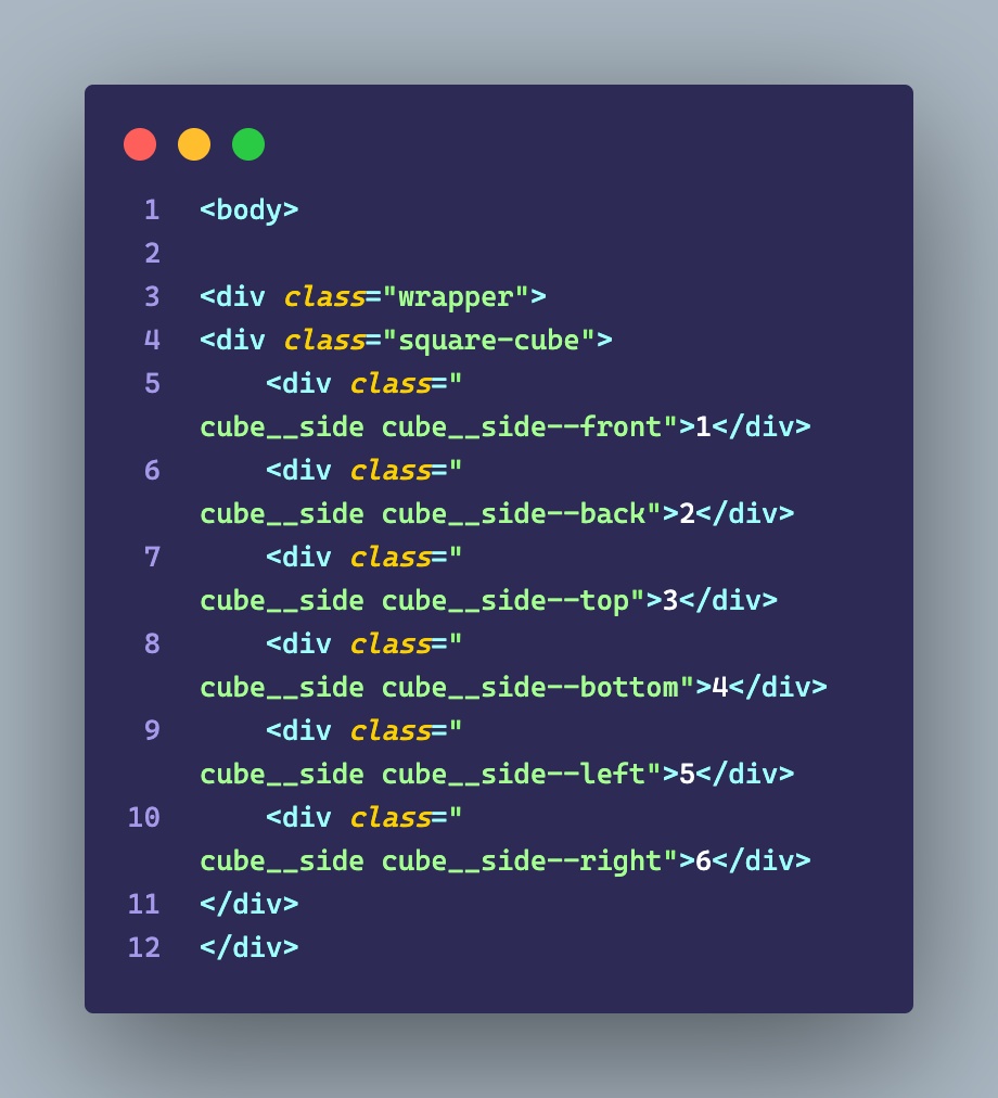
Just to give a brief explanation about the structure:
"Wrapper" div is like your container. It’s holding all of the other divs you’ll need for the cube. Everything will be neat and consistent as long as you don’t tweak it too much.
"Cube" div is the main div for your cube. Basically a wrapper in a wrapper.
"Cube Side" deals with each face of the cube itself, and this is where youll need to use CSS to position them properly and style their elements heavily in order to create the correct shape.
Now for the juicy parts...
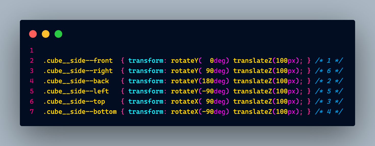
Now that we have the structure set setup, we can move on to our stylesheet. The way I went about it was to use perspectives in the main div "Wrapper" since it contains all the other divs and their elements, bringing in the whole cube to be animated properly.
The perspective property for a lack of a better way to explain it, allows you to control how an object is viewed on the screen. If you want to see it in action, check out this link ---> CSS PERSPECTIVE
Using the Transform property allows you to manipulate the element by altering how it moves, going by angles, scaling and rotation included. This is what helped me with showing each individual face like so:
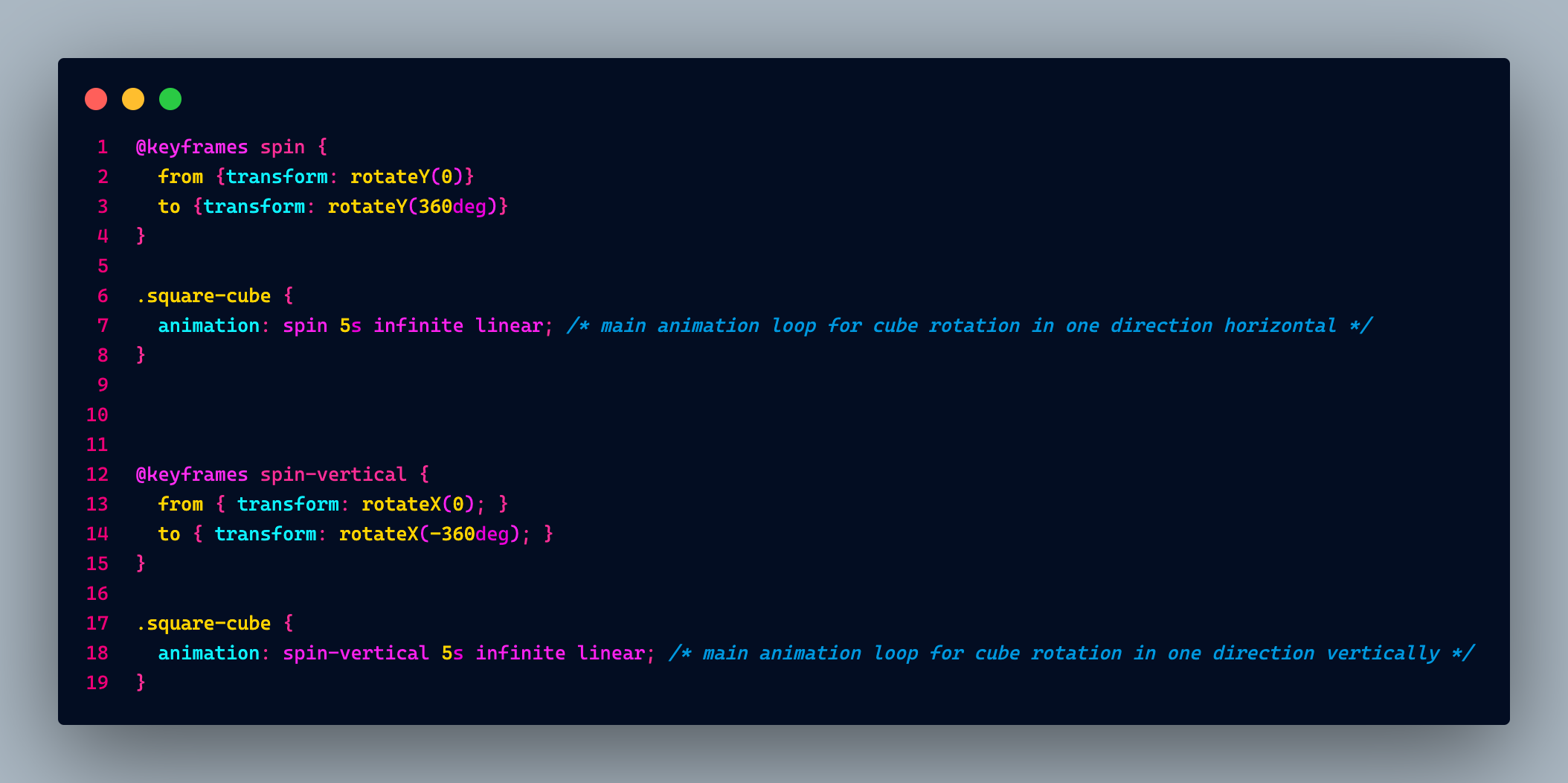
And last but not least, we need to actually animate this cube to either rotate or spin using keyframes, which is better explained here: CSS Keyframes
Once you understand the basics of keyframes, you can modify and define the waypoints in order to create custom animations like this:
Some things you need to keep in mind:
-
The position is key! If you're comfortable with CSS then you already know the rules for position hierarchy with divs involved.
-
You'll need to play with perspectives to get a full grasp of what you can do with it.
-
Transform also has specific styling so you need to understand how that works.
Think of this as a nudge or little hints to get you familiar with this type of styling in your code. Hopefully, this helps get you started at least, and you'll be able to build from there.