Building User Enabled Dark Mode
Tags:
Using CSS and a bit of Javascript magic
At some point I decided I wanted a different look for my site without going through the process of building out a whole new theme for it. With that in mind, I wanted to accomplish two things:

Goal one: KISS (Keep It Simple Stupid):
You probably heard this before either online or from other devs. It's self explanatory. I kept this in mind when I wrote down exactly how I wanted this feature implemented.

Goal two: Make it User-Friendly:
This was important as I wanted to keep the user in mind. When you visit my site, you don't have to feel forced to view it in one theme. I kept in mind the fact that there are some dark mode haters out here lurking on the web, as well as people who may want to read it in a normal light mode for whatever reason they choose. You have a choice. No need to feel locked in.
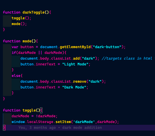
The simplest approach to achieve this functionality was to create a button and write a script with functions that trigger the shift when the button is clicked.

When the darkToggle function is invoked by clicking the button, it performs two actions. The Mode() function switches the interface between dark and light modes instantly upon the user's click. Meanwhile, the Toggle() function saves the user's preference in localStorage, ensuring that the chosen mode is retained and reapplied when the page is reloaded.
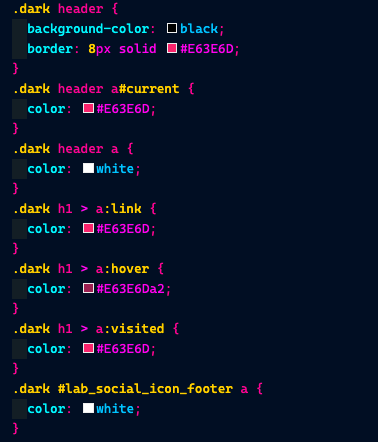
Styling this feature was straightforward. It involved adding extra selectors in the CSS to target elements modified by the script, specifying their appearance based on the user's selection.
I adhered mostly to the principles of Brutalist design, which emphasizes clear, readable fonts and straightforward links without decorative images, focusing solely on text.

And that's it! For more detailed implementation, check out my repository. Recently, I've switched to using SASS for compiling my CSS, making the site build process more streamlined while maintaining readability. Feel free to explore the GitHub link for a closer look.